Vertical layout
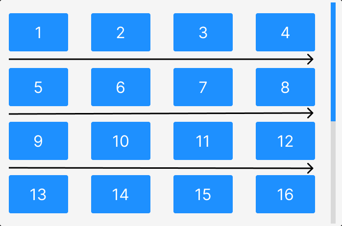
The default layout for the Grid is the Vertical layout, which consists of a fixed number of columns and a vertically scrollable grid container. The number of columns is calculated automatically based on the specified gap settings and the width of the grid container. The following image displays the Vertical layout of the grid and the scrolling direction.
The gridLayout property of the Grid component enables the Vertical layout by default, and it can be specified explicitly by setting the gridLayout property to VERTICAL. In contrast, the HORIZONTAL value enables the Horizontal layout.
import { Grid } from "react-visual-grid";
import "react-visual-grid/dist/react-visual-grid.css";

const images = Array.from({ length: 20 }, (_, index) => ({
  src: `https://picsum.photos/id/${index+1})}/800/600`,
  alt: `Image ${i + 1}`
}));

return (
  <div>
    <Grid
      images={images}
      width={800}
      height={600}
      gridLayout="VERTICAL"
    />
  </div>
);
The above code snippet illustrates the use of the Vertical layout by setting the gridLayout property to VERTICAL. It renders the grid with 20 images and a width of 800 and a height of 600 pixels.
In the next section, we will explore how to use the Horizontal layout of the grid.